

.jpeg)
.jpeg)

I think this has a successful usage of font style as this campaign uses a recurring font style and the use of colour schemes between the posters which illustrate cohesion conveyed to the audience. There is also a recurring reminder of the shows name "power" with the new additional name to show, showing who the show is going to be about. Done to show the linkage between the programs, reminding the audience on how they are all related. This show also has a interesting character favoured by many, which is the reason why most people enjoy the show, because of this the campaign uses characters that are directly connected to the main character, which is a good way of advertising their show as they could still gain additional information of the main character, by watching the show. The show also includes a celebrity, which works as a benefit to the campaign as this brings in a wider targeted audience.
The unique selling point of this advert is usage of the sengoku period theme added, with mr bean who doesn't have any type of connection with the point of time which creates nostalgic feel to the audience. This advert differentiates from other adverts, advertising the same product because of how the advert includes a balance between comedic tone and a serious tone portrayed through the characters, as mr bean is someone who is known for his comedic entertainment mixed with the more serious sengoku period characters. This shows the difference
Learning Aim A:
Presentation link:
Learning Aim B Campaign Planning:
Campaign Planning
Overview.
This is a survey that I created as part of my research where I came up with 10 different questions and received 10 different answers, which I included to build a profile for my campaign and the development of my character, based on the opinions of the people who took part in this survey.
Survey Campaign Research

Name?
Through this question I asked, "What name would best fit a Hip-Hop artist?" I included 3 different names being "Korah" "LK" and "Kay". based on the results of this question, there was a tie between "LK" and "KAY" with "KORAH" receiving the lowest results. Based on this result I chose to name my artist "Kay" as this was one of the two names that were tied together with majority votes, which lead me to decide out of my own preference . I also chose to name my artist's name to be "Kay" as this name would effectively appeal to the target audience.
Does it interest you?
Through this question I asked if, the Hip-Hop genre interests the people who took part in my survey. Based on the results of this question, 70% agreed and said ''yes'', to the genre of Hip-Hop being an interest them and 30% disagreed and replied ''no'' for the genre of Hip-Hop being of interest to them. Through the feedback of the results, i have found out that Hip-Hop is an good choice of genre to pick for my artist to be based around as, this is a genre heavily favored by majority of people therefore, making it easier for my artist to appeal to a wider target audience.


Genre you listen to?
In this question I supplied a list of existing genres and asked, which type of music you listen to. Based on the results I received back, 40% which is majority, voted as Hip-Hop being the most listened genre, (based on my survey) with 30% percent of people voting for another genre, 20% of people voting for R&B, 10% of people voting for Rock and 0% of people voting for Pop. Through these responses, I found out that Pop would've been an negative genre of music for my artist to be based on, as this genre received the lowest amount of votes which would have created an unsuccessful campaign, as it would not have really appealed to a target audience. However, through the responses we also see Hip-Hip with the most votes, which shows a best fit for my artist, in order for this campaign to appeal to an audience.
Color scheme?
Trough this question I gave a list of different color combos and asked, which one would best fit a Hip-Hop color scheme. Based on the results I found out that 50% of people voted for the combo of Blue+Black, this shows that the use of this color combination would be a good use Hip-Hop genre color scheme and a potential layout color theme, as it would be appeal to more people. When first coming up with the color scheme for my artist, my initial plan was Red+Black. However, this thought was changed by the results of the survey as this color scheme was chosen by 30% of people, which was lower than the majority vote, so by me using the majority voted color scheme, this would be creating an more effective campaign that would target a wider target audience. I also used the combo of Blue and black for my color scheme towards my campaign because of the connotations that these two colors hold together, with blue being seen to be a calm color that would appeal


Promotional Products?
In this question i asked about, what type of Promotional product would be a good way to promote an album. Based on the results I received, I found out 90% of the people voted for social media being the best way to promote an album. This tells me that majority of would most likely be spending time on social media platforms, so by my artist promoting his album on different types of social platforms, he would be more prone to appealing to his target audience.
Costume?
In this question I supplied a list of two between, casual and smart wear costumes and asked, out of the two which one would best fit a Hip-Hop artist. Based on the results I received back, 90% of people who took part, voted for casual wear, with the remaining 10% of people voting for smart wear. This tells me that an artist dressed in smart wear clothings would be less effective, compared to an Hip-Hop artist dressed in casual wear. Therefore, as I am creating my artist, I am going to make sure my characters dress sense would consist of casual wear rather than smart wear as this would would be more effective, for an Hip-Hop artist.


What do you prefer?
In this question I supplied a list of 3, asking for what the audience's preference was out of, a solo artist, a Duo asrits and a Band of 3 or more. Through the results I received back, I found out 50% being majority preferred a Solo artist over the remaining 2. Therefore, by making my artist a solo artist, would be beneficial to my campaign as most of the people who took part in this survey voted for a solo artist, so by making my artist an solo artist I would be grabbing the interests of majority of people.
Do you listen to music regularly?
In this question I asked if, the audience listens to music regularly. Based on the reposes I recieved back, I fond out that majority of people listen to music on a regular bases therefore, I am going to make sure my artist releases music frequently in a great pace as this will allow my artists audience to, be able to listen to new content of music frequently and this would also be a good way to keep the interests of my target audience as they wouldn't get bored.


Platform of Music?
Through this question, I asked about the what platform of music the audience listens to. Based on the responses I received back, I saw a consistency of the audience picking Spotify, for where they listen to music on. Through Spotify having majority votes, I am going to make sure my artist makes it essential to release music on Spotify as, this would appeal to a rage of audiences but, I am also going to make sure that my artist makes his music content accessible for all types of platforms as this way, certain people won't be limited to where they can listen to my artists music, which will benefit my campaign because of the number of people that will be investing their time in my music.

Artists Name, Age and Gender: My artist is going to be, a 21 year old Male upcoming artist, Named "Kay".
Background: My artist is going to be a mix between American and English.
Artists dress sense: My artist is going to be costumed mainly in the typical category of the stereotypical rapper. However, would be seen wearing outfits that contradict the stereotypical rapper, having his own sense of style at times.
Genre. The genre I decided to chose for my artist was the Hip-Hop genre. The reason on why I decided to chose this genre for my artist's campaign, was because of how this genre is shown to be the most majority rated genre, evident in my survey. And also chosen because of how this genre has been recognized as the dominant genre since 2017 becoming bigger than "Pop and Rock", according to the "Billboard Staff". Therefore, already showing how my artist would already be appealing to a great amount of audience just through the genre.
Album Name: My artists album name is going to be called "Unique Not Average".
Color Scheme: The color scheme for my artists products is going to be Blue+Black although, my initial idea was for the color scheme to be Red+Black out my personal preference. However, this idea was changed because of the responses I received back, causing me to change my idea to change, so my artist would be able to effectively appeal to his target audience.
Release date: The release date for the "Unique Not Average" album is going to be 20th June 2022. As this would be the time where most people have free time, and would be more likely to be listening to music.
Tour dates for album/Location: This album is going to be a 3 month international tour. This would be beneficial to my artist campaign, as this would expand recognition towards my artist.
Platforms: This campaign is going to be a cross media campaign, with my artist being able to be found on all social medias. Examples being, Tik Tok, Instagram, Snapchat, Websites and many more.
Some Hashtags: #We ain't average, #7even, #Only Unique, #UnT...
My artists Icons: These are the main people most influential towards my artist, Xxxtentaction, Tupac, 50cent and Jcole.
Artist Collaborations: These are some the rappers that my artist may be collab with, Lil Baby, Dababy, Nba Youngboy, Blove, Sheff G, Sleepy Hallow, Lil durk, Nle Choppa and more.
My Artist:
Fonts: For the fonts, I am planning to use an drip like font as this type of font is a font that heavily links with the genre of Hip-Hop

Some Fonts:


Conventions:
How is cohesion created through the different products?
Cohesion is going to be expressed in my campaign through firstly, the color schemes that are going to be used, In my campaign. I am going to make sure that I have a main color that will run throughout all my products, this will be done to express a sense of linkage between all my artist's products, which will be used to help the audience recognize the products of my artist. Through this, I am going to try and incorporate an effective color scheme towards my artists products as, I have come up with a color scheme being blue and black, chosen by the people who partook in my survey. Another way in which cohesion is going to be used to express a product, is through Merchandise. with examples of these products consisting of, hoodies, hats, tracksuits, graphic t-shirts, shoes, posters, socks, phone cases ect. As the use of these merchandise products would be an effective way of advertising because of the range of different products that could be used to appeal to the audience. However, when the merchandise products are going to be sold for my artist, I am going to make sure the pricing is going to be reasonable and to an affordable price, as the merchandise would appeal to a wider target audience this way, which would be beneficial towards my artist rather than making my pricing to an high price, which only be appealing to the upper class, therefore limiting the audience reached. Another way in which cohesion is going to be expressed, is going to be through how costumes is used.
How do artists from this genre normally promote themselves?
Hip-Hop artists would promote themselves through different social media platforms such as, Instagram, Snap chat, Twitter, TikTok or websites. These types of ways of self promotion is a used, because of how the genre mainly targets the people between the ages of 18-34 years which, would stereotypically be the ages of people that are would be on social media, therefore being an good way to to appeal to their targeted audience. Another way in which artist's from the genre of Hip-Hop promote themselves is through paid promotions/collaborations with different companies with some examples being, Magazines and Clothing stores. These ways of promotion is used as a way to expand recognition from different audiences that might follow these companies, to go to the artist they are promoting.
Are there any specific way in speaking/communicating that these artists use in your chosen genre?
In the genre of Hip-Hop that I have chosen for my artist, majority of people don't speak in an casual way, but rather in an urban way using forms of slang to communicate. However, when it comes to my artist I am going to try and incorporate the urban way of talking to some extent mixing it with casual speech as well, to show how my artist will partly fall into the category of a stereotypical Hip-Hop artist but, will also partly show how my artist differentiate from the typical Hip-Hop artist.
How do they get the audiences attention.
My artist is going to be grabbing the attention of the audiences through passively promoting himselve through merchandise, through social media posts, mentions from bigger people, doing stuff that are unique/original and appealing directly to the targeted audience.
Where do this genre normally advertise their product?
Artist's from the genre I have chosen normally promote their product using different social media platforms that would benefit the specific product being promoted. An example would be, how Instagram is used to promote an album as, the artists would be posting posts and going on live talking about when the album is going to be released, where the album is going to be releasing in and where you would be able to access. Another way in which hip-hop artists normally promote their products is through collaboration with bigger artists.
What font style have I chosen?
I am planning to use a recurring san serif font between all my products. I have chosen this font, because of how the fonts basic and would be easier for the audience to see if placed in an area.
Radio script:
VO: Brought to you from the two time MOBO rewarded artist brought you "Gold".
M: (Play song for 5 seconds)
VO: The number 1 charted single "Gold" is widely known for its viral "Tuned challenge" on Tik Tok.
M: (Play song for 6 seconds)
VO: Kay presents to you his debut album- "Unique not Average". recommended by "WoldStar" and described by "RAP" as "The album that is going to heavily impact the generation of Hip-Hop going forward". With 50 cent also crowning the album as "A new dawn" . Available on all platforms and accessible in all countries on June 20th- available for Pre orders now.
Drawn drafts
ALL ALBUM COVERS:
Pure Hearted Album Design
This is one of my three drawn drafts of a music album cover for the hip-hop artist. In this drawn draft, i included a serif font in a cursive style as, this holds heavy connotations of creativeness, symbolising maturity which was done to reflects my artists personality in a way. As my character is someone who does not fall into the typical stereotype of a traditional Hip-Hop artist. In this album cover, I also included a golden heart in a thought bubble coming from the character below. Which was included to link to the actual name of the album being "Pure Heart" as the connotations of gold symbolises pureness and wealth and with the heart symbolising love and passion. The use of the character being placed at the bottom of the page looking up at the golden heart is used to also portray my artists personality as the golden heart connotes an kind nature which was used to symbolise a message of my artists aspiring to have a kind and pure heart, but is still troubled by the gold, placed behind the character. which is used to symbolise the worldly priorities that is held by society. This album cover also includes a use of colours to create cohesion and linkage between all my artists products. The colours I have chosen to use for this album cover is going to be blue for the background white for the font. the combination two colours going to be included also in my track list colour scheme, tour posters, album posters and track list. However, overall I would say this album is my least favourite design but, is shared between being successful and unsuccessful. Firstly, I would say this album cover would be unsuccessful because of how the images on the page do not entirely engage with all of the free space, which would be unappealing and ineffective as an Hip-Hop album cover should be more visually enhanced to gain the target audience's attention. However, I would also say this album cover was successful, because of how the album as a whole conveys a message that could be interpreted by the audience. This album cover also includes a use of colours to create cohesion and linkage between all my artists products.

FONT:

San Serif Cursive font

FONT:

In My Bag Album Design
This is my second drawn draft of my artist's album. In this draft I included a San serif font placed around the top middle of the page, done as a way to effectively visually enhance the title so the audience would be able to read clearly. I used money as the main image theme for this album cover because, I wanted to show how my artist partly shares the same characteristics of the typical Hip-Hop artists being, the message of the glorification, towards money and wealth. When it comes to the money, I am going to be colouring them in red rather than the traditional colour of green. I am also going to making the main background of the page black and the words White along with the money sack. Reasoning being for this would be because, when it came to my survey, red and black along with another combination of colours consisted of the highest amount of votes from the audience. Therefore by me using this specific colour combo being blue and black, I would be achieving my aim of effectively appealing to my target audience. Overall, I would say I personally liked this album design, because of how majority of the page is engaged by designs that link with the titling and the message behind. However, I would say an negative towards this album design would be, how there isn't really any specific features that directly connects the album to the artist.
Mind The cap San serif font
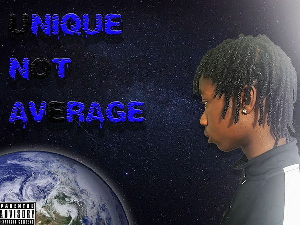
Unique Not Average Album design
This is my third and last drawn draft for my artists album cover. In this cover, I decided to have the words big and bold on the page, to do its part, in drawing the audience's attention to the album cover as a whole. The font I used was a Nosifer font, which I chose to highlight the key aspects of how the font appears to look, as the font gives off a urban tone, which would link to the Hip-Hop genre because of how the genre symbolizes cultural and ghetto portrayals. For this font, the color I decided was blue, with the background being black. I specifically chose these main two parts of my album cover to be colored in these two colors as, this was the result of the majority voted outcome, I received when distributing my survey, being blue+black. By me using it as the theme of my album cover, this would be a good marketing strategy as my artist would be effectively appealing to his target audience. I decided to make the background color black with a little white stars in between, because I wanted to simulate an out of space tone hence, the earth like planet being placed right in the bottom left. I also included an side view angle of my artist, in the bottom right corner next to earth because, I wanted to convey a message of my artist not falling into the same ideals and goals of what most people may have, which would also link with the title further expressing how he views himself differently to the average person. Over all I would say this is my personal favourite design for my artists album cover out of the three because, of how the Nosifer font used with my artists album cover, makes the album covers genre easily recognizable to understand what type of genre the album is. I also like this design, because of how the album doesn't look basic in anyway , and is fully engaged with the page.

Font:

Nosifer font Serif Font
ALL TOUR POSTERS:
Pure Hearted Tour Posters

This is my drawn draft of my artists tour poster for Pure Hearted. In this this draft, I firstly included the same type of cursive font throughout the poster, key images that featured on the album cover, social media platforms to follow up with the artists, tour dates and locations. When developing this drawn draft, In order to enhance cohesion between my products, I decided to include key features such as the same colour scheme and the same usage of and images and font style. I also decided to include a mentioning of my artists website and four socials of where my artist can be found along with the names and the website for people viewing to know where to book tickets for the tour, and to receive additional information about the tour and the artist. In this tour poster, I also specified the tour type being a, National Tour featuring 9 different places with 9 different dates, been a 3 month long tour. The date I chose were the the first three months of the year being an winter tour, Which would not be very beneficial to my campaign as, his fans would be less likely to be wanting to go out around this season as it may be too cold. Therefore, making is a near summer tour/spring tour would be more impactful, as more people would be more likely to go.
In My Bag Tour Poster

This is my second drawn draw of my artists tour poster for the "In My Bag" album. In this draft, I decided to use the same font recurring all throughout the poster, and I am planning to use the same type of colours I used for the album being, red and black as the colour scheme along with the same images I used in the album, in order to create cohesion between all the products that links to the In My Bag album. I decided on making this album a regional tour based in England featuring 6 different states, that is going to be taking place around summer time. I chose this tour to take place in the summer because of how, the demographics for the Hip-Hop genre would be people of the ages of 18-34 but, also would consist of the ages of 15 and upwards, which would mean most people would have free time, as they would be on their summer break. This tour poster also includes hashtag of the slogan that goes with the album. This tour poster also includes a directions on where to book tickets to attend the tour through my artist's website, and additional socials on where you can find my artist. Such as TikTok, Instagram, Snapchat and twitter.
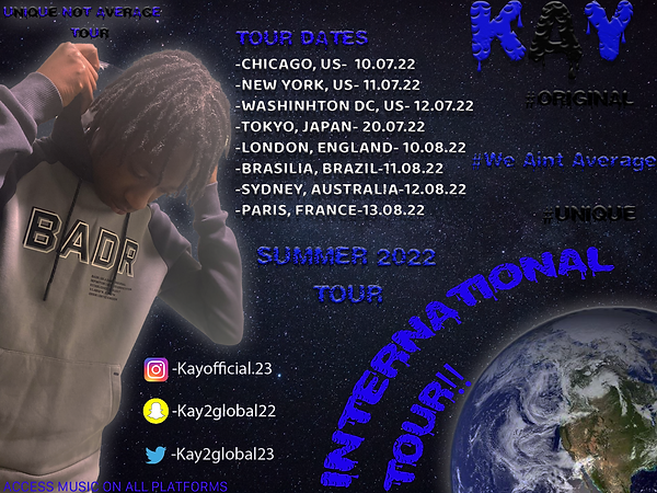
Unique Not Average Tour Poster

This is my third drawn draft of my artists tour poster for the "Unique Not Average" album. In This draft I included the usage of the Nosifer font and a basic San Serif font used all throughout the tour poster, the same space theme design and the same use of colour being blue and black. The use of including all these elements to my artists tour poster, was to also create cohesion, which is going to be really effective as the aim is to make sure the audience knows who the product is being made for, the message its trying to bring across and the other products it links to. In this tour poster, I specified what type of tour it's going to be, being an International tour featuring 9 different locations and dates. I decided to make this tour a summer tour because of how this would be a time where majority of people are available and the people who would attend would not have to worry about the weather. This tour poster also includes a reference to the website where, people will be able to access and book tickets and his socials, just there so the audience would be able to keep up with the artist and used as a way to further promote. My artists choice of locations on where this tour is going to be taking place in, consists of majority American states as well as other country's, which was done this way because how my artist is an American, so therefore paying homage and showing love to his country.
All THE TRACKLISTS DRAFTS :
Pure Hearted Tracklist Poster

This is my draw draft of my artists tracklist poster for the ''Pure Hearted'' album. In this poster, I included the song titling's and features of the album, a recurring cursive font and a piece of imagery that featured on the previous to products that links to the ''Pure Hearted'' album and colour scheme, to create cohesion. The reason on why I decided on this album consisting of 4 big artists collaborating with my artist was because of how, each artist has their own individual fan base and target audience, therefore through these artists joining and collaborating with my artist, this would be bringing in a wider targeted audience, which would be very beneficial to my artist campaign, increasing the fan base of my artist.
In My Bag Tracklist Poster

This is my second drawn draft for my ''In My bag'' album. This poster includes the same colour scheme and same font included and the recurring money falling background theme as the other two posters, creating linkage between products. This album is going to be having 5 different songs featuring three different well known artists.
Unique Not Average Tracklist Poster

This is my third and final drawn draft for the ''Unique Not Average'' album tracklist. This draft firstly includes the same repetitive Nosifer font throughout the poster, which was done to make the audience easily understand what campaign this belongs to. The space theme elements (stars and earth) which was also included, to reinforce cohesion between products. I decided to make this album a solo artist album without any features with 8 songs, which was done this way to highlight my artists potential as an upcoming artist.
ALL MERCHANDISE DRAFTS:

Pure Hearted Merchandise draft
This is my drawn draft for my artists "Pure Hearted" album. In this draft I matched the same cursive font I used in my previous product, included in the titting of my artist merchandise page. This draft has five different merchandise products, mainly consisting of different clothings a vinyl record and a poster. The reason on why I decide on making majority of the products include of mostly clothings rather than different products, was to fit into the target audiences preference as, majority of the audience of the Hip Hop genre would consist of adults of the ages of 18-65, Meaning that majority of people who would be listening to my artist would be interested in clothes rather than other merchandise products that would appeal to children, which would benefit my campaign as the products that are being sold, would be in their preference. When it came to the pricing of the clothings being sold, I made sure that the prices were displayed in Pounds and US dollars as my artist is American and English rapper, I also overall, made the Merchandise choice of pricing the cheapest out of the three drafts, because of how my artist would want everyone to be able to purchase piece of his merchandise, which would therefore cause more people to be purchasing the merchandise increasing the amount of income that would be gained by the merchandise. The use of my artist adding a vinyl record to his merchandise store, was to give a way for people that are not really modern or just don't like generational gadgets and would prefer more old fashioned way of listening to music, to be able to listen to my artist music.
In My Bag Merchandise draft
This is my second drawn draft for my artists "In My Bag' album merchandise store. In this draft I decided on making this consist of the most expensive piece of products out of the three album merchandise stores. I did this because, I wanted to make sure the earning that would be gained, would be of a great amount to my artist. However, doing this has its benefits but also its down sides, as by making the products high in price would partly mean the upper class audiences would be able to be purchasing these products mainly, but would be impactful to the lower class audience and not in their favour as they won't be able to afford any of the products. being sold, Which would deem to give a negative impact to my artists campaign as a whole, as not everyone is upper-class and would be able to purchase the products with ease, lessening the outcome of the money that will be gained. The images used on the products are the album cover, hashtags, my artist face and the theme of the album.


Unique Not Average merchandise draft
This is my third and final drawn draft for my artist's "Unique Not Average" album merchandise store. In this draft I also included the two types of currencies included to the pricing of the products being sold. to emphasise my artist being an American and English rapper. When giving the brief description on the product being sold, I made sure my artist included a specification of the clothing being unisex or not, and whether the product was exclusive or not. I decided to included these key features to my artist merchandise store, because I make sure my artist audience have insight on what they are purchasing, and by naming the product "exclusive" this will give a push for the audience to purchase the item as the titling gives it that unique touch that would make the audience want to purchase. The images placed on the products include signatures from my artist to give the product a personal appealing, picture of the album cover and hashtags that are associated with the album. I made this merchandise store consists of products that is not expensive neither cheap, but affordable which would be effective, because this would mean that majority of the all different types social classes, would be able to purchase the products being sold in the store, which would be good for the campaign's overall income.
Website Draft
Artist Website Draft/Planning:


.jpg)


This is a drawn layout for draft for my artist's website. In these drawn drafts, I decided to include an about page which would have a background description of my artist as well as some photos of my artist, which will be done to help the viewers learn more about my artist. This website is also going to include an album description, which would have an explanation of why I decided to choose the name for the album and the meaning behind it. This page will also have clear visualized text of the album name with the actual photo of the album placed below. This page will lastly have a brief description of the sales of the album and how well it did. The use of me adding this page to the website, was to make sure the audience receives insight into the background of the album. For the third page, I decided to make this the tour information page, where the audience will find out where the upcoming tours are going to be taking place, where to buy the tickets and the pricing of the tickets. The fourth page is just going to be a photo dump of the artist, just showing a range of different photos. And the last page is going to be a social media page where the audience could go keep up with my artist on different platforms such as, Instagram, Snapchat, Twitter, Emails and more.
All Billboard Posters
Pure Hearted Billboard Draft
Unique Not Average Billboard Draft


In My Bag Billboard Draft
This is three drawn drafts of Billboard posters, on three different album drafts created by my artist. In these drafts, I made sure that they each had their recurring font styles along with the theme and an image that was included in each original album cover. By doing this, this will therefore create cohesion and linkage between all products, expressed to the target audience.
All Album Digital Drafts
Pure Hearted Album Draft

Unique Not Average Album Draft


In My Bag Album Draft

This is my digital draft for my artists album, that I created from my drawn draft as a digital representation form how my album covers are going to look.
Tour Posters Digital Draft
Pure Hearted Tour Poster Digital draft

Unique Not Average Tour Poster Digital Draft
In My Bag Tour Poster Digital Draft

This is a digital draft for the Tour poster of the albums that I am planning to produce . This was included as a further plan out of my drawn drafts for these album Tour poster.

All Tracklist Digital Drafts
Pure Hearted Tracklist Digital Draft

In My Bag Tracklist Digital Draft

Unique Not Average Tracklist Digital Draft

This is a digital draft for the tracklists of the albums. This was included as a further plan out of my drawn drafts for these album tracklists.
Learning Aim C:
Creating Products:
%20(1)%20(1).png)
Tracklist
.png)
Tour Poster
Billboard Promotion:

Social Media :


This is Kay's Instagram account. On this account Kay uses posts like the two below, to give announcements to fans. As we see Kay posting a post about the release of his new upcoming album "Unique Not Average". In the post about the album Kay includes hashtags and emojis to create a friendly appeal to to his fans.

Snapchat


This is Kay's Snapchat account which is also used, to mainly notify his fans for his all his future announcements. On This account Kay also posts an announcement post to notify his fans about his new upcoming album.


This is Kay's personal Twitter account, which is also mainly used as a way to notify his fans, for the latest news and announcements, as we see with the tweet he posted to announce the release for his new album.
These are all Kay's created social media accounts. The use of Kay having a range of different social media accounts was a highly effective choice and a way to further expand and interact with his fans, as Kay would be able to make sure his fans are tuned in with his latest announcements, that they would not want to miss. When creating Kay’s Twitter and Instagram accounts, I made sure that his fans had a straightforward way of accessing his website through putting the link to the website in the bio. By including the website in the bio, this would help the fans find out more about Kay, leading them to further additional information that they would not have known before and would make them want to check out more. I also decided to include Hashtags that I originally planned out, to My artists social media accounts, because of how hashtags are often used to make content discoverable and being a way to effectively reach more people on the social media apps.
website:

Note:
The intended price shown was supposed to be in dollars, however, wix didn’t give me a way to make the products pricing in dollars
LEARNING AIM D:
Campaign Review
Interview Questions
I organized 3 interviews on 3 different individuals that fitted into the targeted age range for the Hip-Hop genre being, between the ages of 16-65 years old. The main purpose of this interview was to gain personal feedback from the people who took part in the survey, to see what they thought about it. Through the feedback gained overall, it was successful as the questions I asked were mostly answered positively. However, some of the negatives and improvements I received were to increase the pricing of my artist’s priced products, being the merchandise and the tour tickets. Which was shown to be a recurring concern highlighted by two of the people who took part in the interview.
Survey Questions Feedback:
.jpg)
In this question, I asked how well my website looks professional from a scale of 1-5 with 5 being the best and 1 being the lowest. Through the feedback I received, it shows how 66.7% of people rated the website to be a 5 being the best, and a shared amount of 16.7% of people rated the website either 3 or 4. Through the insight from this graph, this tells me how most people thought my website was professional and liked by most viewers. Which is good, as this means the overall content of my website was effective and professionally made to a high standard that satisfied the audience. However, the other 33.4% of people who rated below 5, this tells me that I would also need to improve my website a bit more to reach an elevated level, that all the audience would view as professional.
.jpg)
In this question, I asked if my merchandise products were professionally made. Out of the 6 responses I received, 5 people being 83% said my products were professionally made “To some extent” and one person being 16.7% said “Yes” to my products being professionally made. Based on this feedback, this just further tells me that, I need to work on how I graphically design my merchandise in a way that would effectively appeal to my artist's target audience, as the main aim is to make sure my artist’s fans would want to purchase my artists products through its just its visual appealing's.
.jpg)
In this question, I asked if you would personally buy my artists merchandise products. Based on the feedback I received, I found out that 100% of the people who took part in this survey would purchase one of my artist’s merchandise products. This just shows how effective my artists merchandise products are.
.jpg)
In this question, I asked what specifically caught the eyes of the viewers when on my artist’s website and why. Through this question the most common features that specifically caught the eyes of the people who took part in this survey were the font used and the background theme as most of the people thought the use of font and background was unique. This was a good response that I received, as it meant that the overall choice of background was a successful choice, as I managed to create a theme that expresses a different and appalling tone to my artist’s viewers.
.jpg)
In this question, I asked how effective my use of color scheme was when it came to my artist’s website from a scale of 1-5, with 5 being the highest. Through this question 83.3% of people rated the color scheme to be a 4. Whereas 16.7% of people rated the color scheme a 5. This is overall satisfactory results as 4 is not low at all and was the most picked number, which tells me that the choice of using Blue and Black as my color scheme, was a highly effective choice that fitted well with my website along with the genre intended being Hip-Hop.
.jpg)
In this question I asked, if I could change the color used throughout, what use of color should I have used. The feedback I received was mixed with different opinions of choice of colors. However, what they all had in common was that most of the colors said were bright centered colors, which could mean improving would include lighter colors rather than a dark colored theme.
.jpg)
.In this question, I asked if the font used was appropriate for the Hip-Hop genre. Through this question, I received a 50/50% pickings between the voters picking “Partly” and “Yes”, the font is appropriate for the Hip-Hop genre. This feedback shows how the font I decided was an alright choice of font but could be changed to a better font that would easily make all the viewers understand that the font would fit into the genre of Hip-Hop rather than just half of the voters. As only half thought the font was appropriate for the genre, that means that the research done on fonts was done well to some extent. However, I would need to research more so I could find the perfect font for the hip-hop genre.
.jpg)
In This question I asked if my album cover looked professional and why. Through the feedback I received from this question, all the people who took part in my survey said the album cover looked professional. This is particularly good as this shows how creative I was when making my album cover and shows how eye catching the album cover is.
.jpg)
.In this question I asked if the tour poster looks professional and why. Through this response, I found out that the tour poster was effective and looked professional, said by most people who voted. However, some improvements stated were to increase the number of dates for the poster as most professional tour posters have lots of tour dates. Therefore, If I was to improve my tour poster, I would incorporate this through making sure I have over 10 dates and locations. Another improvement that was said was to not add my artists social media accounts to the poster. Which I would not include if I were to improve my tour poster as social tags are also what you would never be seen on professional artists posters.
.jpg)
In the last question I asked, for something that the viewers liked the most on the website but also an improvement my artist’s website could include. Through the responses I received back, I found out that people liked the use of a color scheme, the album cover and the merchandise. This is good as this means that my overall research into these products was proven successful as they are highlighted by the people who took part in my survey. However, some improvements that was said were, the way in which I sometimes used the font in a dark color and how it was sometimes hard to see. To improve I could change the use of color I use on the font sometimes to make sure the viewers do not have a tough time trying to read. Another improvement was the design of T-shirt, to also improve the way my merchandise is graphically made, I would need to be more creative to make sure the product my artist is selling would be wanted by everyone who sees the products. Another improvement for the website would be the neatness of the about page, making it more presentable and professional.
Overall review
Overall, I would say this campaign was a successful campaign, as I was able to effectively make all my intended products to a high standard and was also able to create cohesion between my products. However, before I started the actual development of my products, I conducted a survey that consisted of 10 questions and received 10 answers. The purpose of conducting this survey was to help create a campaign/artist profile for the artists I was planning to make. In these questions, I asked questions that would help me pick the name of my artists, supplying 2 two names and asking which they thought out of the two fitted the hip-hop genre the most, I asked questions about the type of color scheme I should use, what genre they personally listened to etc. After I fully analyzed the feedback of my survey, this gave me an idea for the essentials of my artists profile such as what genre my artist is going to be (Hip-Hop), what costume (casual/ stylish dress sense), color scheme my artist will have (Black and Blue), the type of font I will be using throughout my artist's products (Drip type font) and the main theme, being a (Space theme). After this, I made a rough artist profile based on the feedback I received which talked about, the name of my artist, my artists dress sense, the name of my artists album, tour dates, color scheme, platforms, fonts and more. After planning out my products, the first product I made was the Album cover. The album cover I made is effectively made as I included the main color scheme being blue and black with the use of the drip font that is used throughout my products creating cohesion between the products made. In this album cover I also included a clear visual of my artist directly around the middle of the album as this makes it clear whose album it is. However, what people thought was successful and what could be improved based on the feedback of the survey and the interview questions I conducted, someone thought that the way the layout of the album was nice, effective, and highlighted how the font sizing was exactly right. This shows how well I was able to satisfy the audience with the visuals of the album, and how the album would successfully appeal to my artist's target audience. But an improvement asked by someone who took part in one of the three interviews I did said how I could improve by working on the free space that is included and was not needed in the album cover. This tells me that to better improve and appeal to my artist's intended target audience, I would need to make sure to be filling all negative space shown in the album cover, not boring the audience. The next product I managed to create was a Tracklist for my artist’s upcoming album. When originally composing the idea for my Tracklist, I managed to follow the ideas of layout I originally intended the album to look like in my drawn/digital drafts. This Tracklist was highly effective as I was able to use the conventional elements of a traditional Tracklist, which would include a clear visual of the name of tracks that are going to be present in the actual album and a recurring theme that links with the album, which I was able to incorporate when making my Tracklist. I also managed to create a tour poster for my artist's album. This tour differs from my original initial layout idea I had in my drawn/digital drafts, because of how I started to produce different ideas, that I saw in a way that would be more effective. Some changes I decided on making to the final produced Tour poster was firstly, the composition of my artist on the page. As I was originally going to place my artist in the middle of poster with the photo being a Close up shot of my artist. However, I decided to change this to a Mid shot of my artist placed to the left. Based on the feedback received about the tour poster Negatives, and improvements that were made by the people who took part in the survey suggested that I should have added more dates in, which I agree with as traditional professional tour posters we see are widely known for having a wide range of different tour dates, especially if it is an international tour. Based on this if I were to change to improve, I would make sure that it is essential that I have a wide range of different tour dates. Another improvement that was made by someone who took part in my survey was to not include the social media of my artist to the poster. This was an effective piece of information as realistically you do not see artists including their socials on their tour posters. Therefore, to again improve on my tour poster, I would take away the social media platforms listed below. Another product I managed to include was a billboard poster which when created, differed from my initial planning idea in the drawn/digital drafts, as I changed the positioning of the billboard to be landscape rather than portrait, Because of how billboards are normally shown this way. I thought this billboard was highly effective as I was able properly advertise my artists album and was able to make instructions clear through adding icons of music platforms to the board, so that the audience would know where to be able to access my artists music from, along with big texts telling the audience this. But if I were to improve something of this billboard poster, I would have changed the photo taken and the positioning of the photo so it could perfectly align with the layout of the text. I also managed to create an artist website for my artist which includes Firstly the Home page which shows, the Album cover with a message under the image which is informing the audience about where they can access the music on. I would say this was a successful page as it contains a simple amount of content that helps the viewers understand more quickly, however, it was not a part of my initial planning in my drawn/draft but was later added when making the website as I thought this would give a more professional feel. The next page to this website is a “About page” which firstly included two images of my artists to, properly introduce my artist to anyone who visits the website. These images are included along with a brief description of my artist background and achievements. The use of adding this type of information to the website was to help the audience find out more about the artist they are going to be listening to, just supplying them with additional information that they may want to know about. The last thing I added to my artists “About page” was a “What you could win” Message. The main purpose of me including this message was to give my artist a way to interact and engage with his fans. The next page I added to the website was an “About album page” which consisted of firstly the Tracklist along with the album cover. The use of these two products being added to this page was made this way to make sure the viewers knew what the information below was referring g to. Under the Tracklsist and Album cover, I added additional information to the viewers about the meaning of the albums name. After this I then decided to include a radio advert which was used to further promote my artist album. This was an effective way of advertising as this would help spread the news about the artist’s upcoming album to different audiences. The next thing I added to this page was a playable sample of the songs on the album. These music tracks along with the radio advert, were not included in the original drawn draft, but were later added to the website because of how I saw it was a creative way to appeal and directly to the viewer. The next page I made for my artists website was the “Tour Info page”. This page first includes the tour poster enlarged on the page, which was done this way, so the audience knows where to read. This then leads to the tickets below where the viewers can easily book tickets for the tour. This page was successful as I was able to make instructions clear, so the viewers will not have any trouble trying to navigate the page. However, an improvement and something I would have done better would have been adding something to the page which would create a personal appeal that would push the viewers to want to go to my artist’s concerts. The next page I added was a “Merchandise page”, where my artist had a bunch of products that could be bought by fans. On this page I managed to add ribbons to the products like “Best selling” or “Exclusive” to push the viewers into checking out the products. Something I would say that went well with this page was how I was able to add a great number of products which I thought were unique and original. However, improvements that I was given through the feedback I made with 1/3 of the people that took part in my interview said that the pricing could have been higher to be seen as realistically priced. Therefore, if I could change something with this page, I would increase the pricing on certain products to a higher price but not too as the aim to make sure that most people would be able to purchase my artists products. The last and final page of my artists website was a “Socials page” where I included my artists email address, and a “Sign up now” entry for the viewers to be alerted of any latest updates that the website may be having. I made sure to include this because again I wanted my artist to make a way for the viewers to engage with the website/artist. This page is an effective page as its quite simple with clear instructions however, if I were to change something about the page, I would focus more on adding more content to the page as the page seems a bit plain and could use more stuff to not bore the viewers. Overall, I would say that this campaign was a successful campaign as I was able to understand and effectively express cohesion through my use of color scheme throughout my products, my use of fonts used and by using the space theme throughout. But to further ensure the effectiveness of this campaign, something I would do different would be to add more creative ways of further promoting the album in a way which would appeal to the intended target audience.